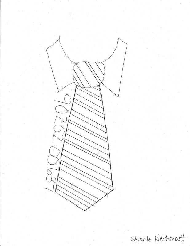
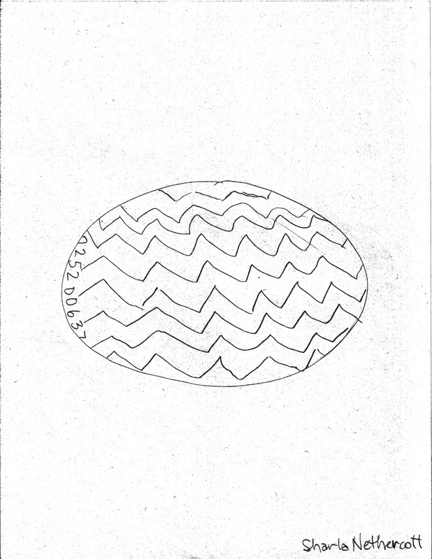
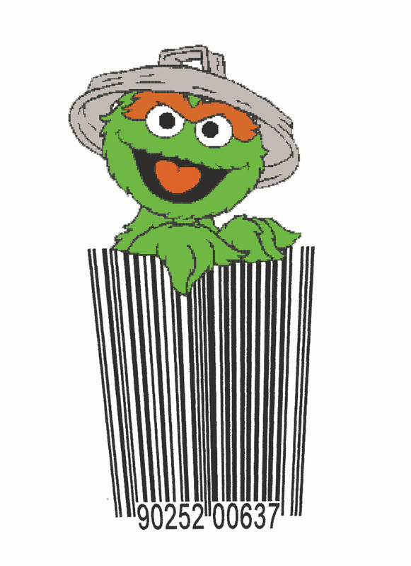
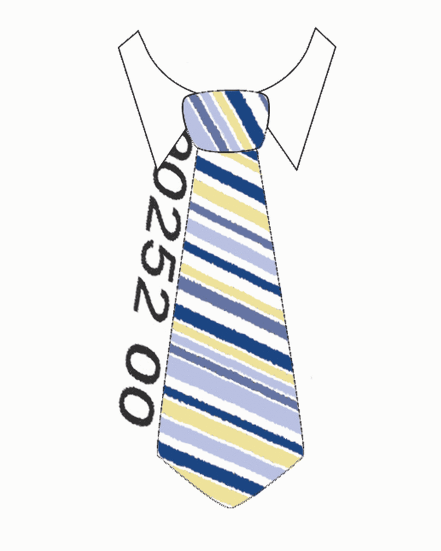
Cupcake UPC
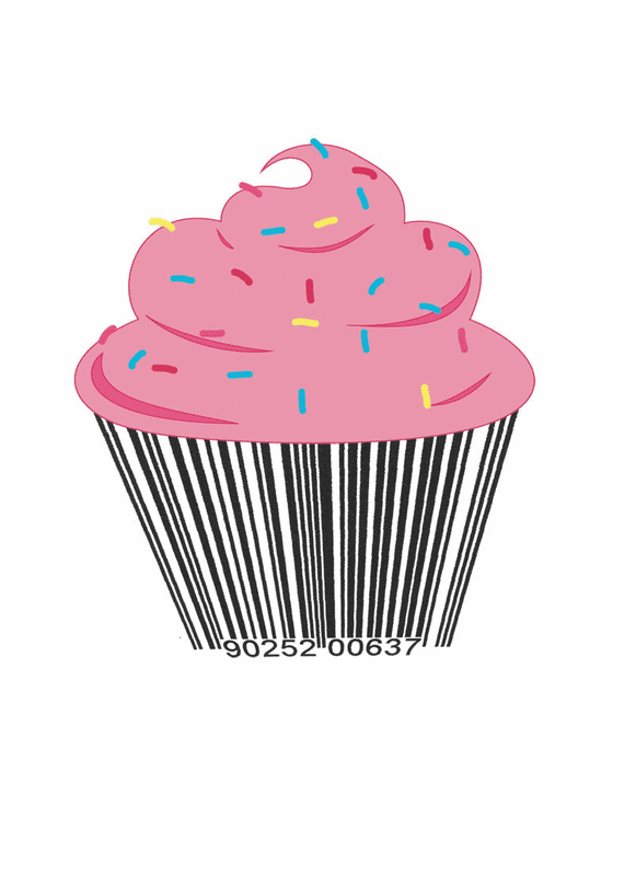
UPC cupcake- Because the UPC is so widely used and we see it so often, it has almost become invisible to us. In my Design Class, we were asked to redesign the UPC to make it recognizable again using our own political, social, or personal statement. I chose to turn the UPC into a cupcake because one of my favorite things to do is bake and decorate cakes. I enjoyed coming up with different ideas to execute the UPC, thinking of things with lines for my inspiration. I think I was successful in executing the design and was able to use my Photoshop skills. This art piece was exhibited at the Salt Lake Community College Spring Art Showcase 2011.
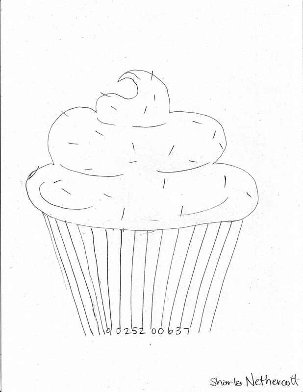
Posterization Cupcake
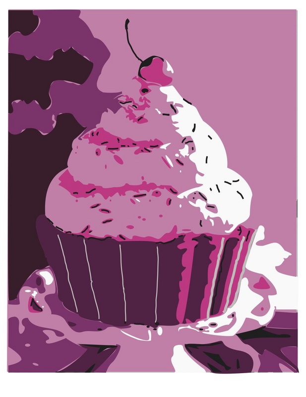
Posterization Cupcake- Once again, I chose a cupcake theme for an Illustrator assignment in my Illustrator Class which we had to “posterize” something. I started out with a picture of a giant cupcake and using the pen tool in Adobe Illustrator CS5, I drew the different contoured colors. This assignment emphasized and taught me organization of layers and colors, becoming more proficient with the pen tool, and using the swatch palette in Illustrator.
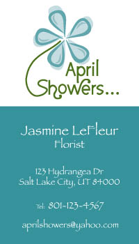
Company Logo and Business Package

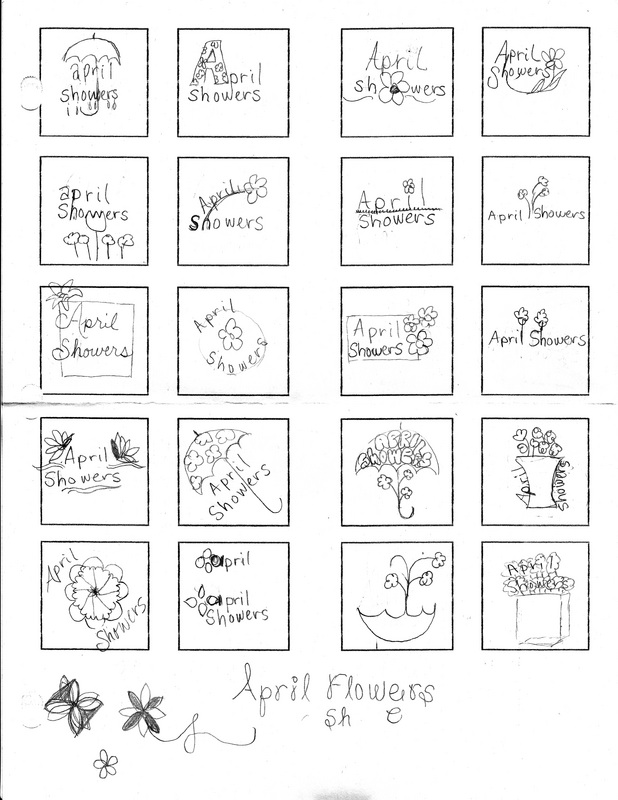
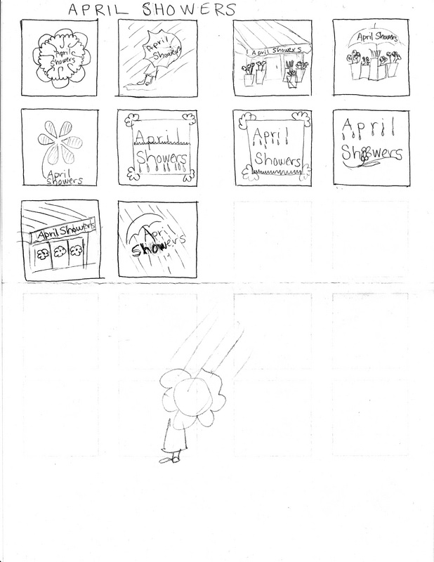
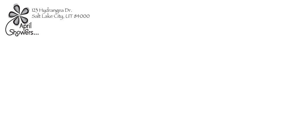
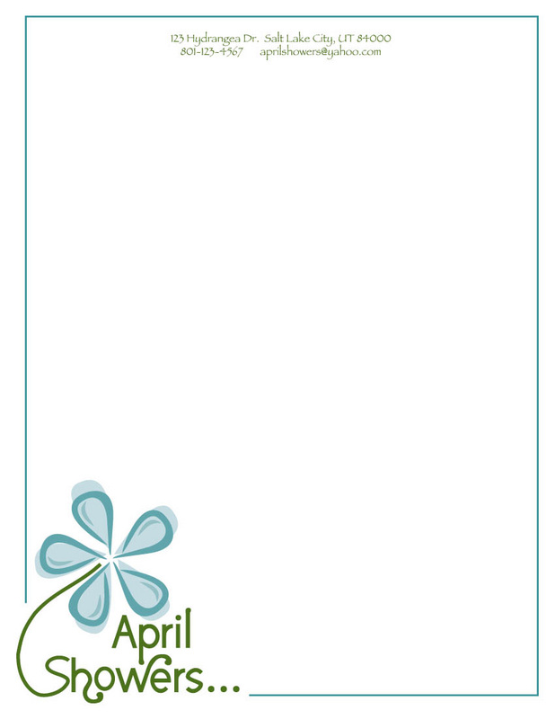
Company Logo-In my Illustrator Class we were assigned to make a 3 Artboard business package starting with designing the logo for a flower shop. I started out by jotting down ideas as thumbnails. From there I searched for a font that enhanced the feeling I was going for. I altered some of the curves of the font to be more pleasing in the layout. I used raindrops for the flower petals to subtly convey showers. We had to use the logo on an envelope only using black printing, 2 color printing for the letterhead, and 4 color printing for the business card, all done in Adobe Illustrator CS5. I enjoyed coming up with differentd ideas to execute the logo and found it to be more challenging than I expected.
Illustrator drawing from a real object
This project was drawing a real object in Adobe Illustrator, I used the gradient mesh to add the shading and highlights.
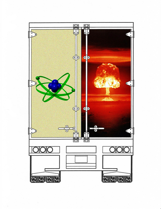
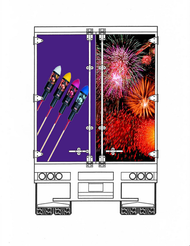
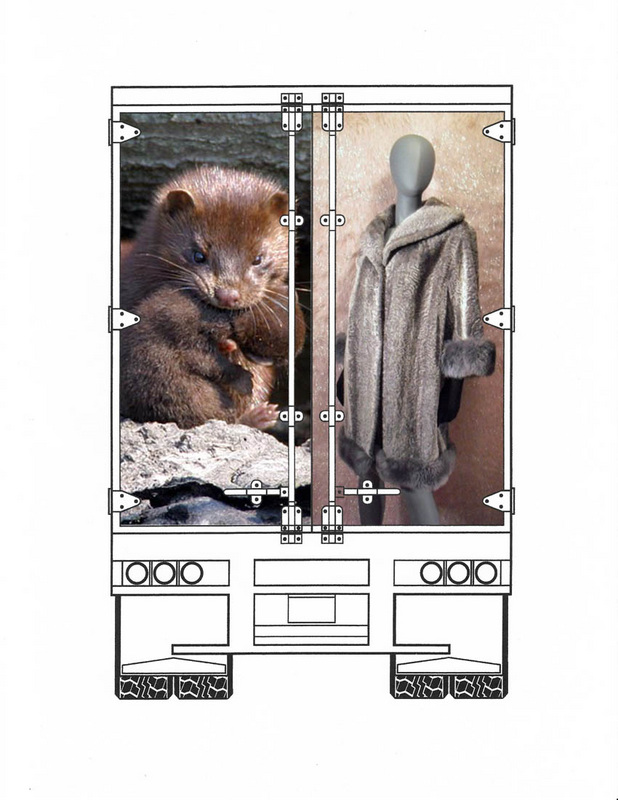
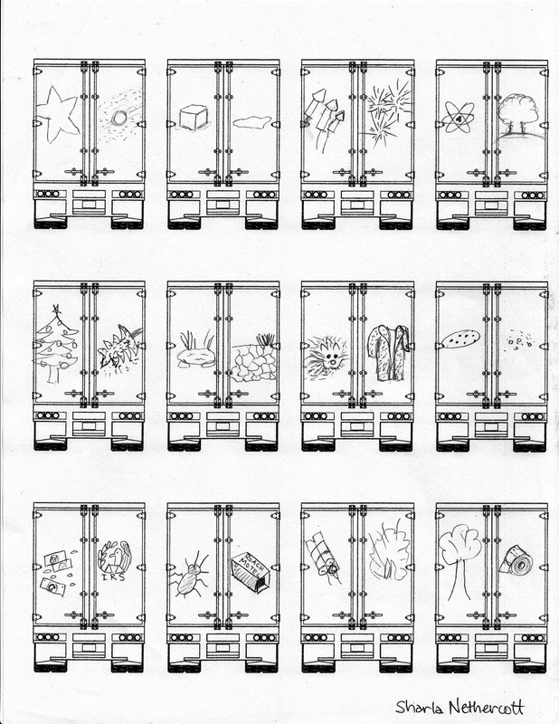
Life or Death
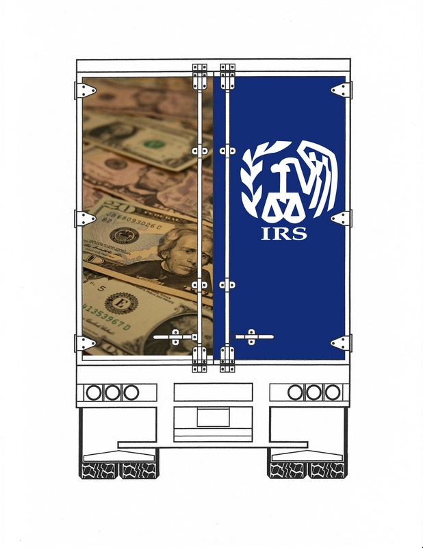
Life & Death- Choosing to pass a tractor trailer on the wrong side of a two lane highway can be the difference between life or death. In this assignment in my Design Class, we had to visually depict life on the left door and death on the right door. I started with thumbnails and did 4 comps. For my final, I chose to do money because we can’t live without money so it resembles life. I put the IRS for the right side because our money is taken away from us (or dies) when it goes to the IRS. I took the picture of the money with a Canon Rebel xti and did the IRS logo in Adobe Illustrator CS5. The comps and final output were done using Photoshop CS5. Although ideas flowed easily for my thumbnails, I didn't find this assignment very exciting or challenging.
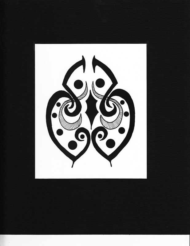
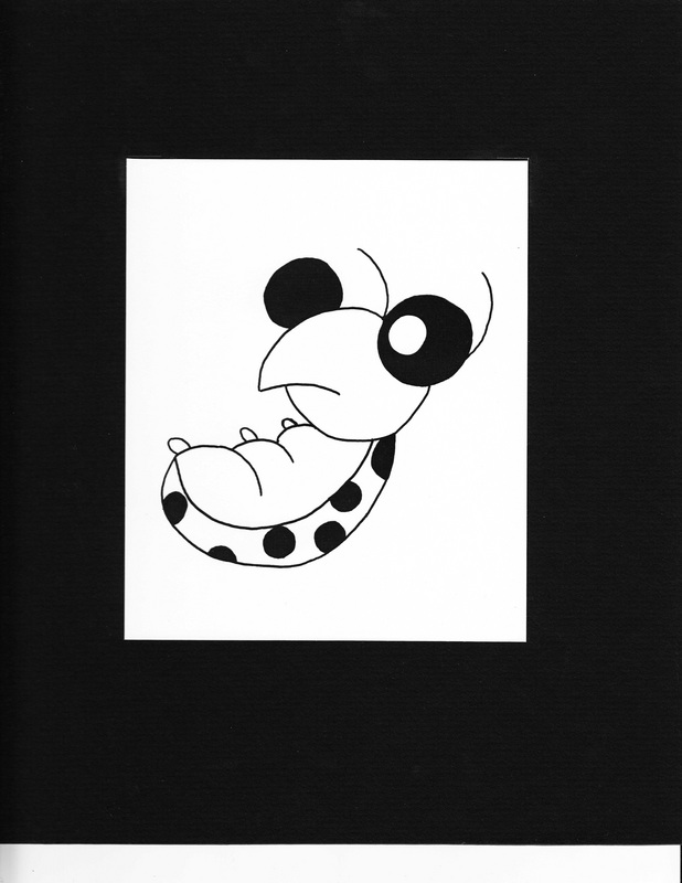
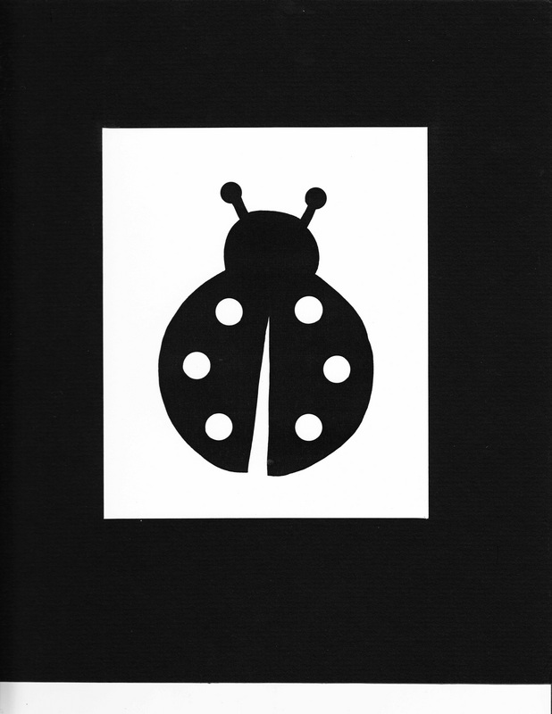
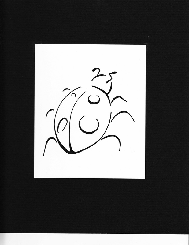
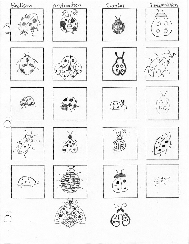
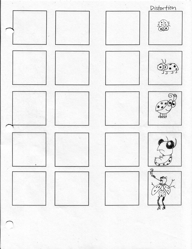
Versions on a Theme
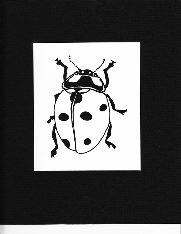
Versions on a Theme- In this assignment for my Design Class, we were to choose an animal or insect and make a drawing for it in five different categories. The categories were: Realism, Abstraction, Symbol, Distortion, and Transposition. We could only use black & white, with no grays. I chose a lady bug since I thought it would be widely accepted from a child, to a woman or a man because it's design could be cute or strong. I drew my roughs on tracing paper double the output size, scanned them, fixed any color problems, and printed them out the size they needed to be. They were mounted on black mat board with a tracing paper flap. I like how dramatic the artwork came out using only black and white. It was fun and challenging trying to come up with different ideas and styles for the same object.
Werewolf Playing Card Design
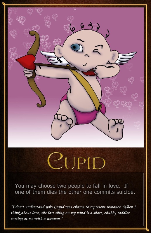
In my Photoshop class we were assigned to make a Werewolf Game playing card. I've never played the game before so I had to research what it was all about. I decided to make Cupid to throw a little twist into the game. I created the background by making a Heart-on-fire brush and placing it on a gradient background. Cupid was drawn and colored in photoshop, using the little trackpad on my laptop!
City Weekly Magazine Cover
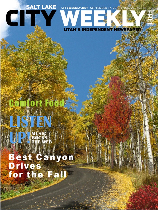
Another photoshop assignment, we had to combine several photos to make a magazine cover. I used five different photos to make this composite. The logo was given to us and we could change the colors to our liking.
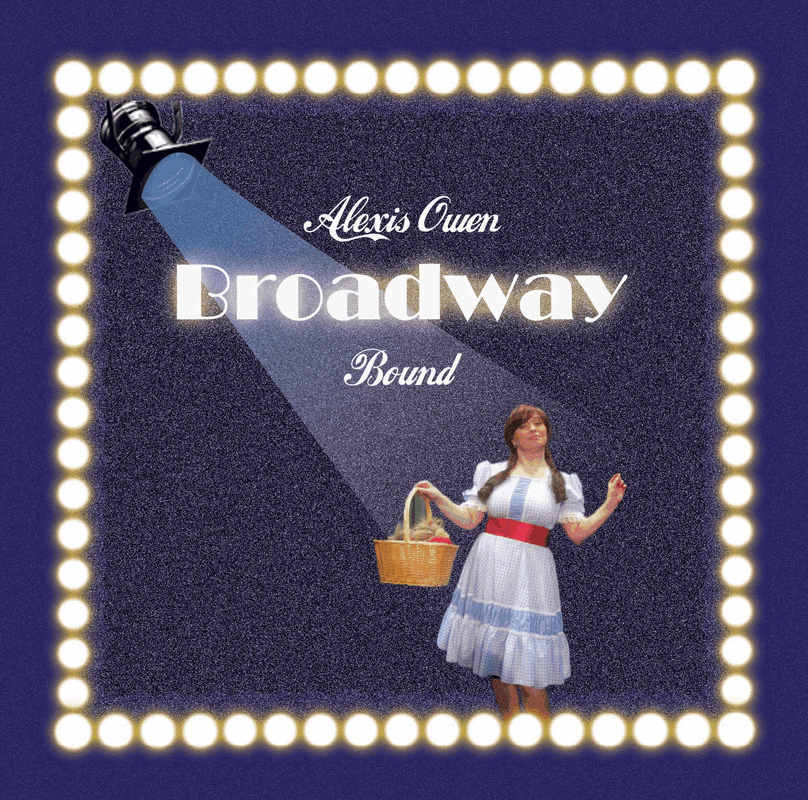
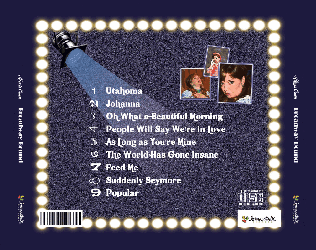
Cd Cover

I created this cd cover in photoshop. We could do anything we wanted but had to create a background and add things to make it look real. I decided to do one of a friend who loves being in plays and musicals. I wanted it to be a surprise so I had to collect all the information and pictures from the internet without her knowledge (thus, the pictures aren't very good resolution!). I created the background by starting with a dark bluish purple and adding noise. I found the spotlight clipart online but had to add a gradient filter to make the beam of light. I made the rows of lights with a brush and added an outer glow filter. She was definitely surprised!
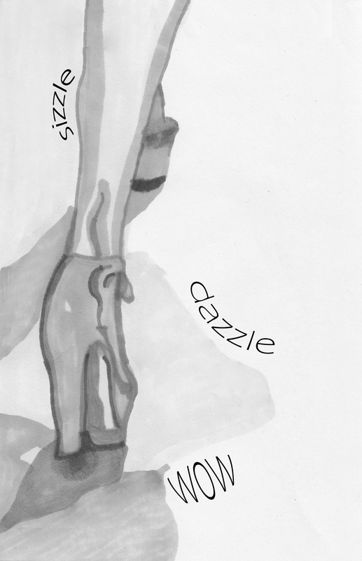
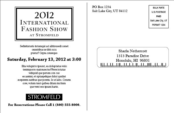
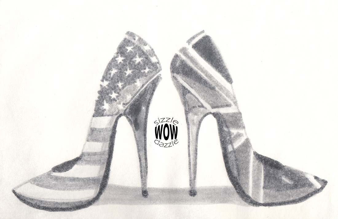
Fashion Show Mailer
In Typography & Layout I had to create a Fashion Show mailer for Stromfeld's Department store. I was required to use the words "sizzle, dazzle, and wow" on the front of the card and also do a photo indication with grey markers. I had to use the logo on the back of the card and create and place the address, barcode, stamp placement, etc. I came up with a couple of different designs that I thought worked.
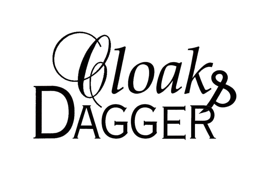
Word Arrangement Project
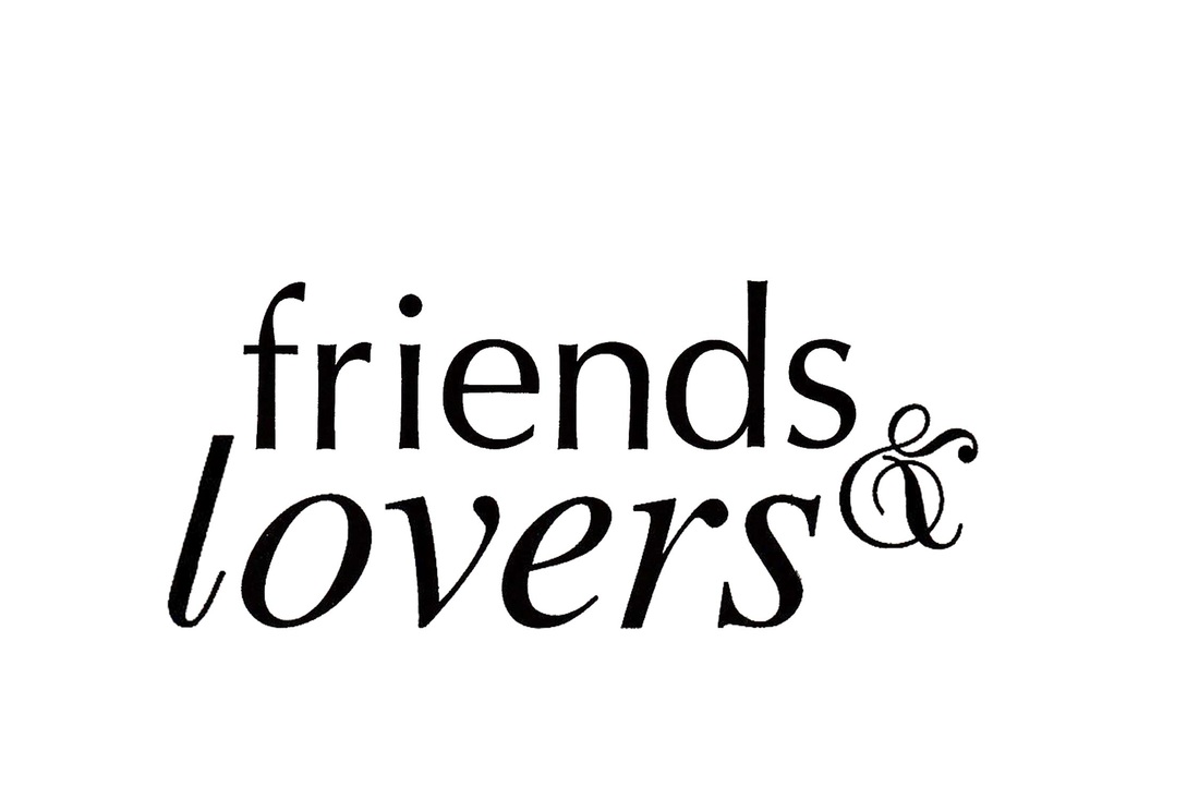
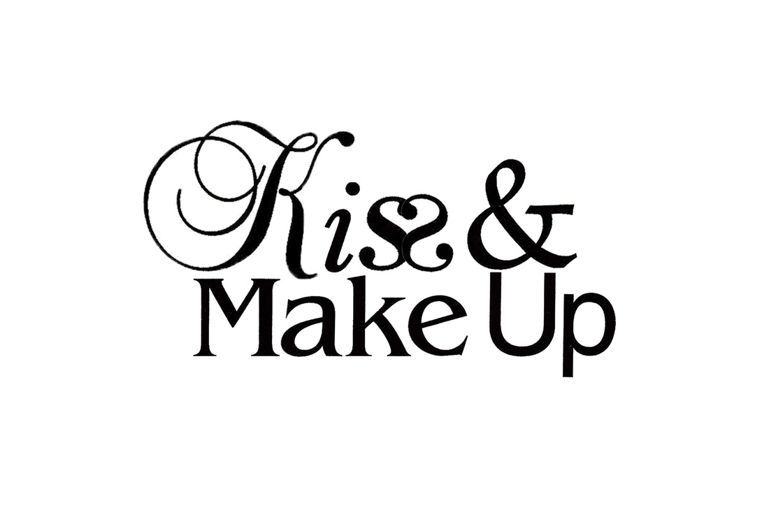
For this project I had to arrange two or names or words, ten or more characters in length, not including the ampersand, in a pleasing design. We were limited in our choice of fonts and had to use at least one calligraphic, one serif, and one san serif. Here's the 3 options I liked best out of my designs.
I like Cloak & Dagger because the "Cloak" font looks flowing like fabric and the ampersand is acting as a dagger, stabbing the "R".
Kiss & Make up I flipped one of the s's to form a heart shape. It is still recognizable and readable so I think it works great to evoke the feeling of love.
I like Cloak & Dagger because the "Cloak" font looks flowing like fabric and the ampersand is acting as a dagger, stabbing the "R".
Kiss & Make up I flipped one of the s's to form a heart shape. It is still recognizable and readable so I think it works great to evoke the feeling of love.
Pointilism Worksheet
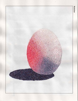
We had to paint an egg using the Pointilism technique which is a million tiny dots in different shades & tones to create the look of a picture. The subject matter was supplied. A first for me painting like this!
